


On Monday, Jan. 17, Western Counties Regional Library launched a new look and website, part of a rebranding process after nearly 50 years with the same look.
District Design Co. is the creative team for the rebrand, and RockFort Media designed the new accessible website.
“Since the design of the original logo nearly 50 years ago, our communities and our library have undergone a lot of growth and change,” says Library Executive Director Erin Comeau.
She says the rebranding better reflects today’s public libraries, what they stand for, and how they are used.
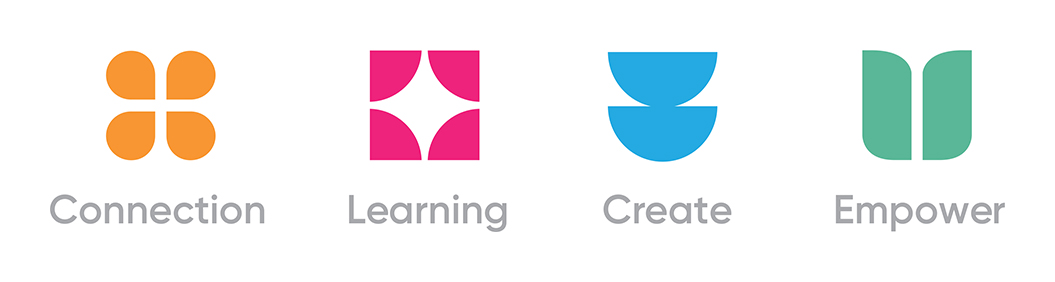
“District Design did an extensive community survey in which we asked our communities what key words come to mind when they think of their library,” Comeau says.
The four dominant words coming out of the survey were connection, learning, create and empower.
District attached a symbol and a colour to each word and incorporated them into the new logo. The colour palette is a balance of warm and cool tones representing optimism, vibrancy, ocean and earth.
This was integrated into the new website which is vibrant, simple and user friendly, Comeau says. “We are excited about these changes and believe library users will enjoy the new look and the user-friendly website,” Comeau says. “Just visit www.westerncounties.ca to see for yourself.”